Website
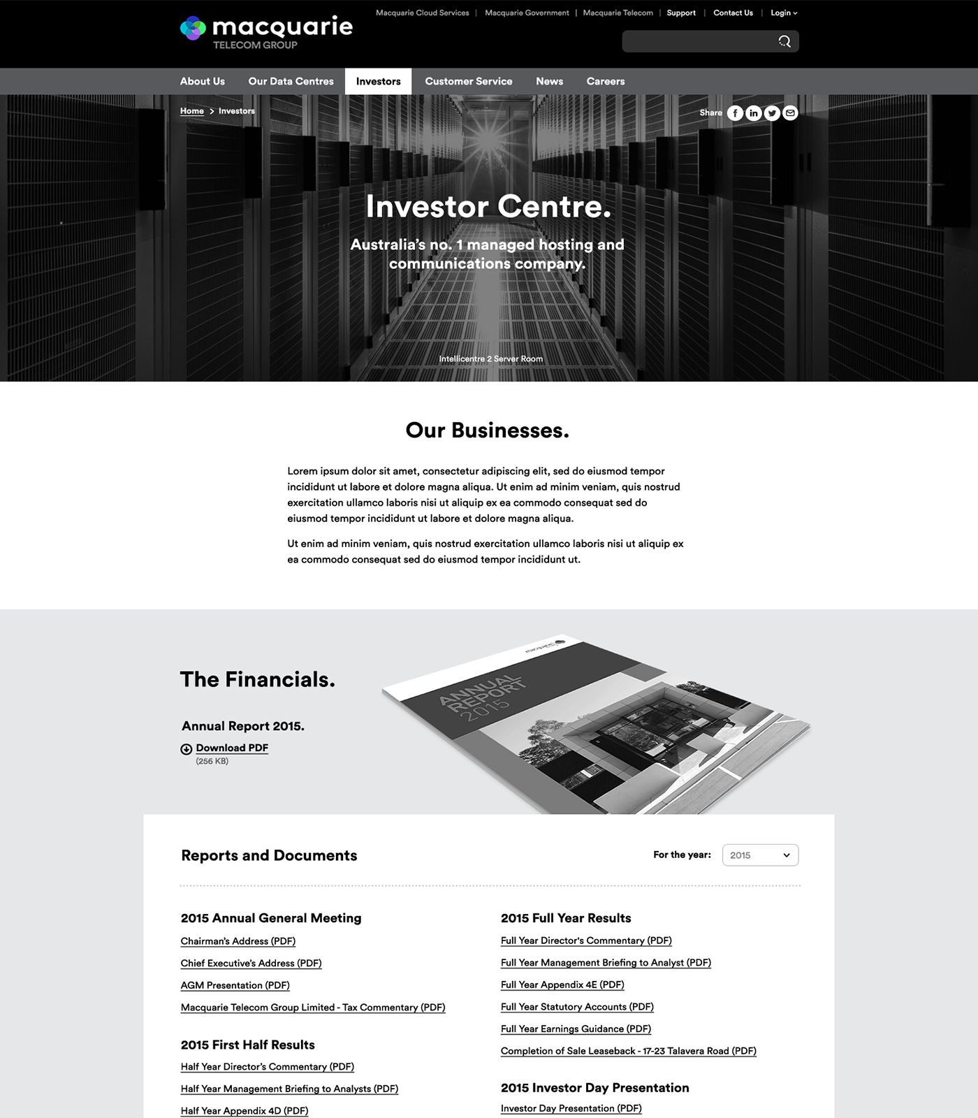
With the best reported NPS score of any ASX company in Australia, Macquarie Telecom Group relied on Rysen to deliver multiple websites to continue this trend of exceptional customer service.
Challenge
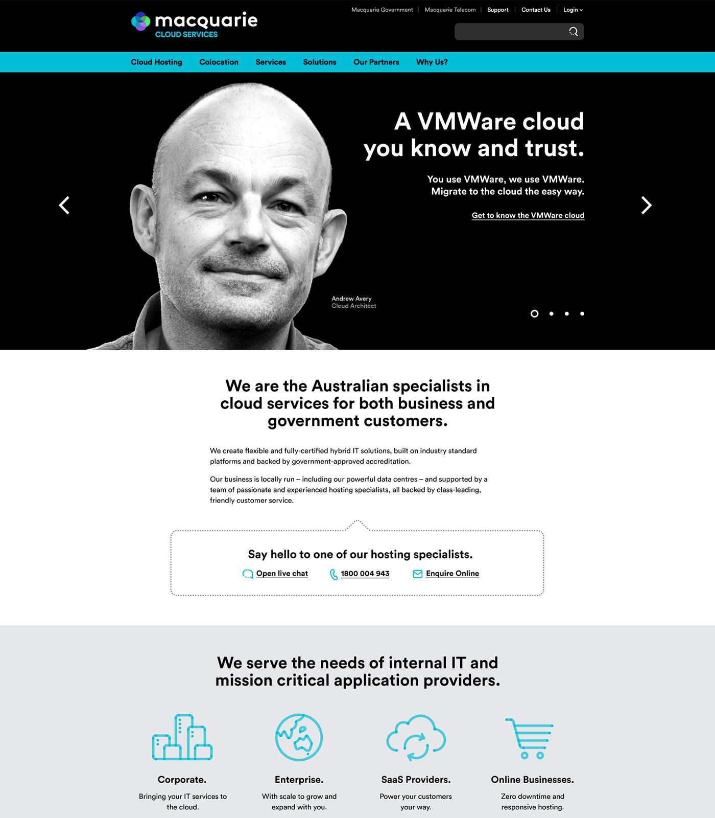
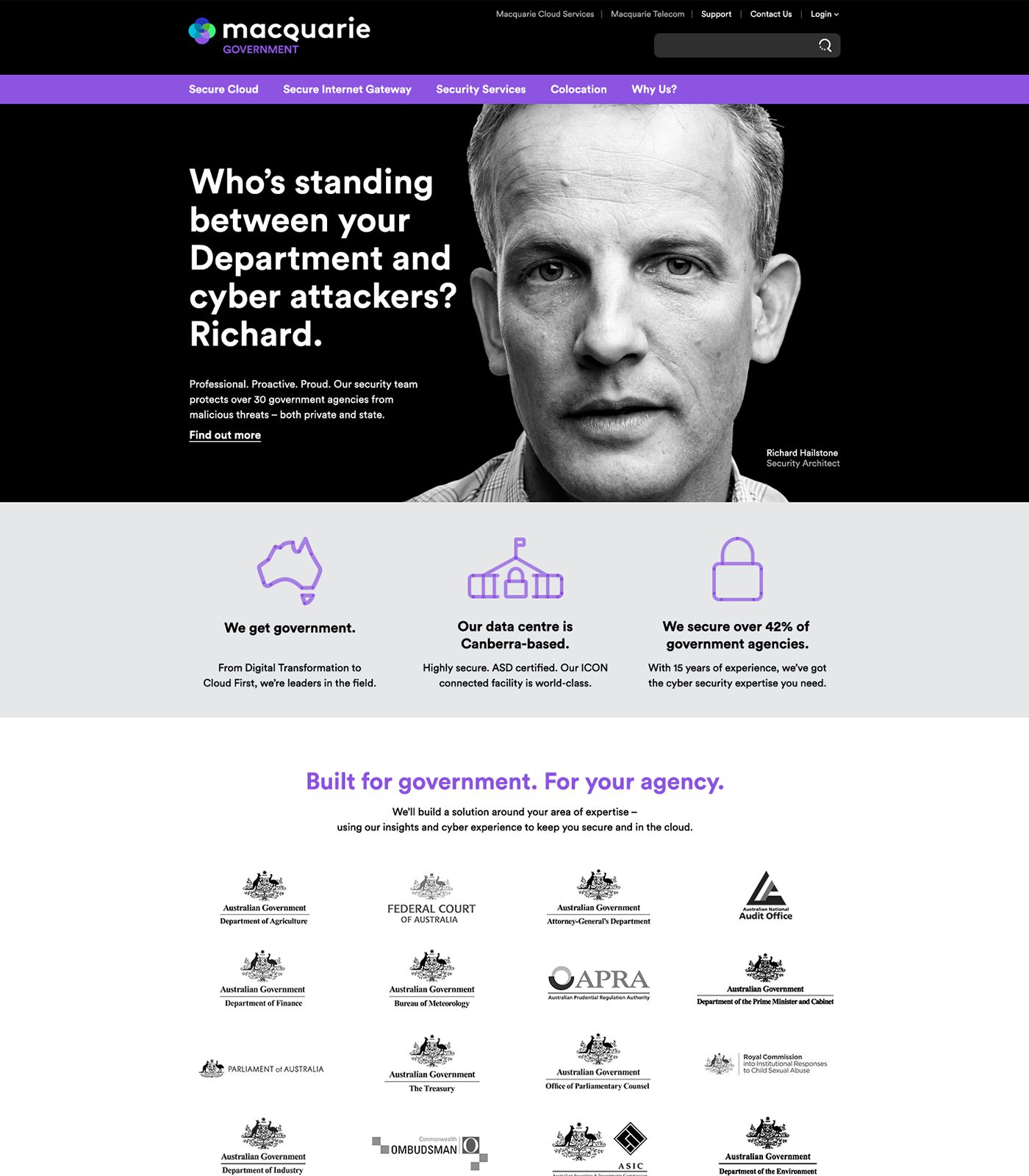
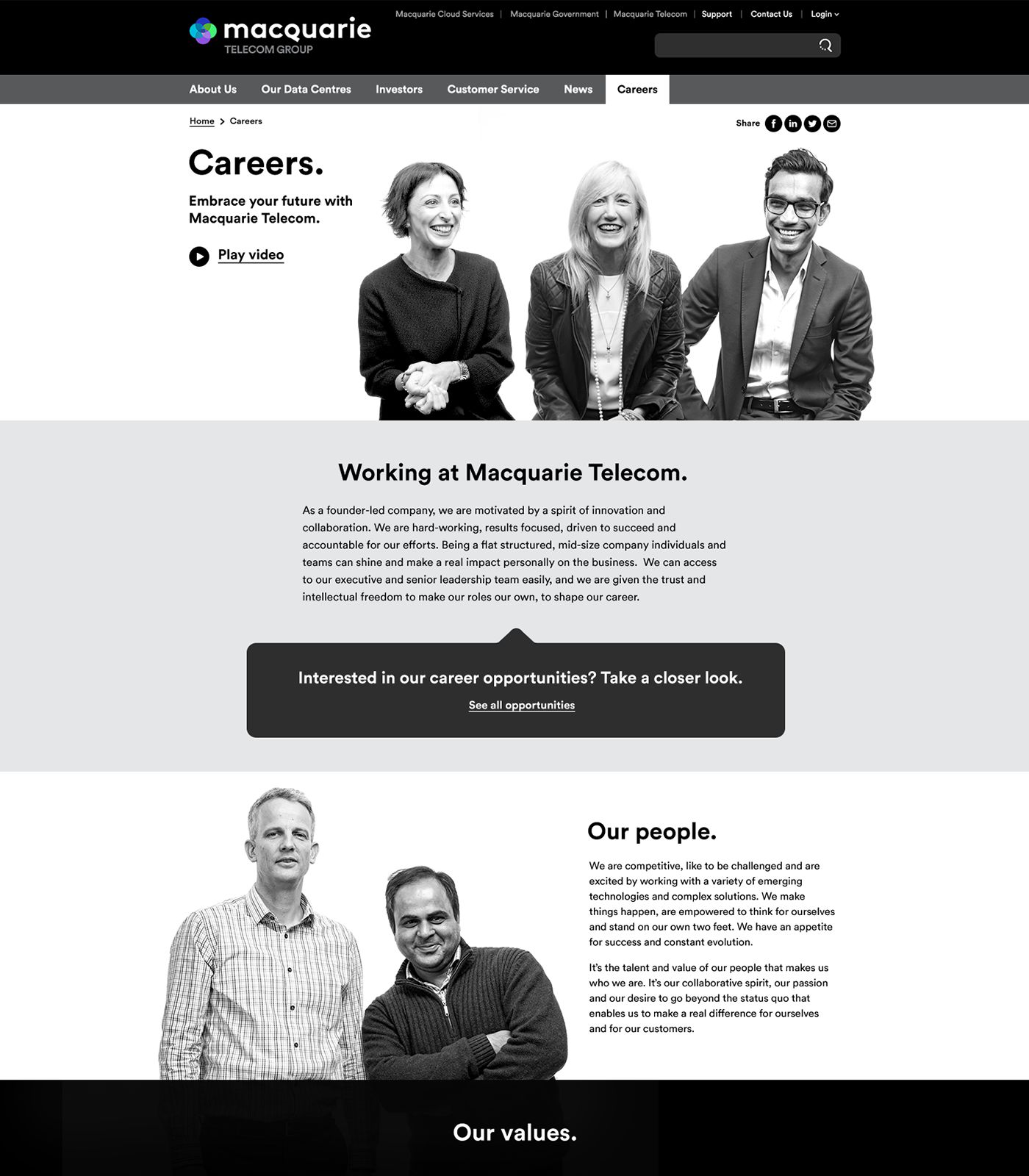
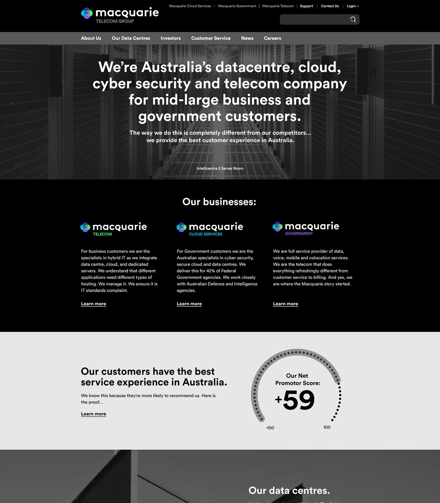
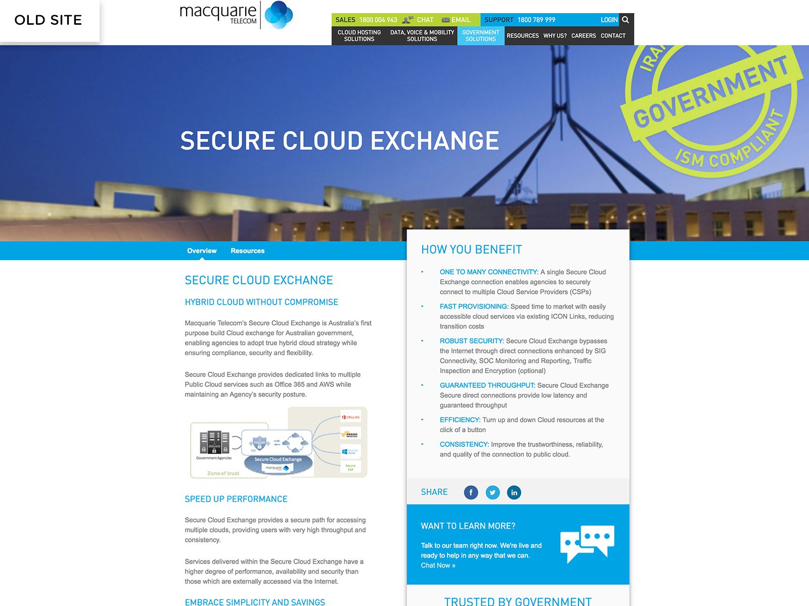
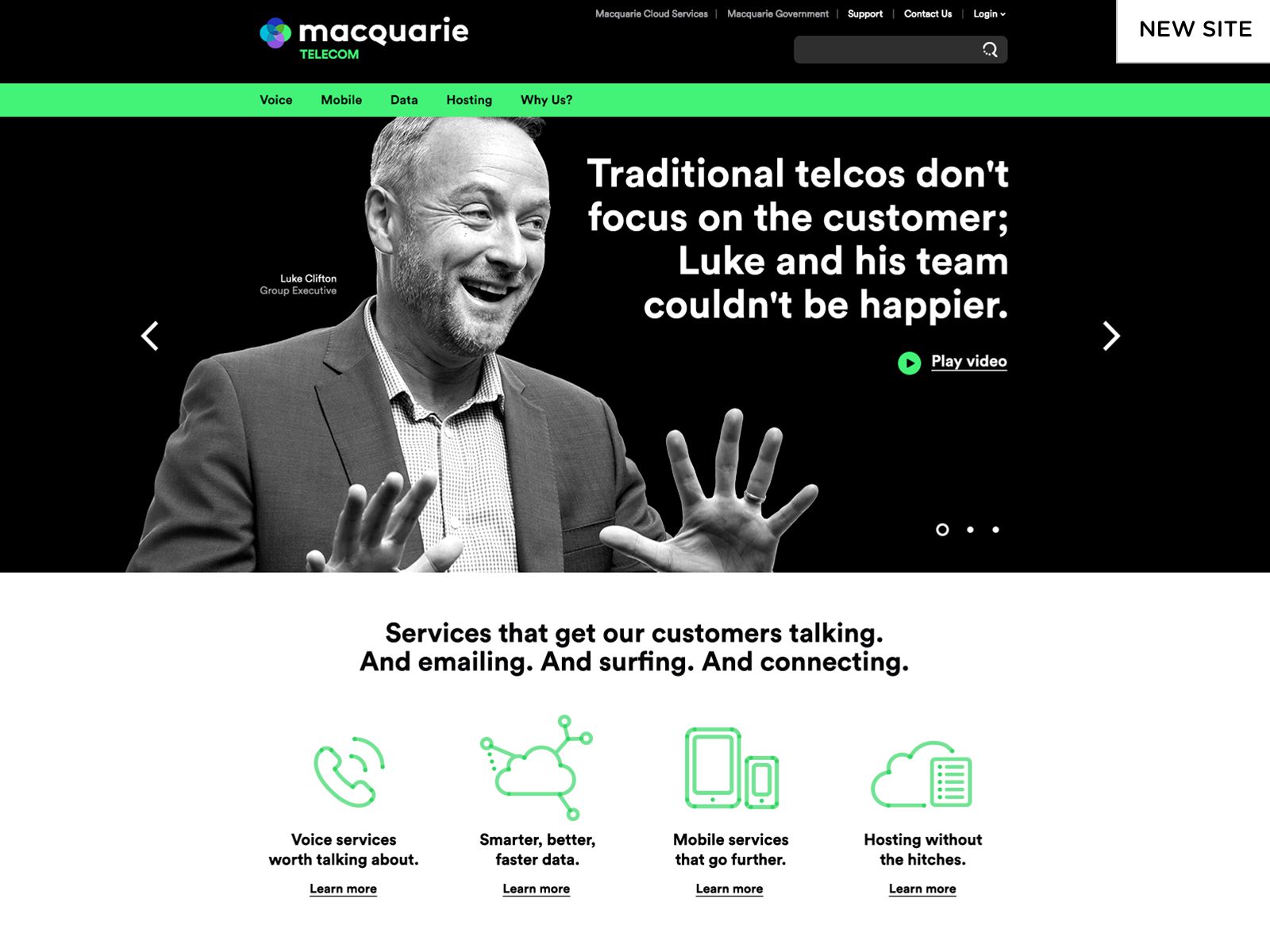
Macquarie Telecom had just gone through a drastic brand evolution to further differentiate themselves and to continue their quest to be seen as not just another telco.
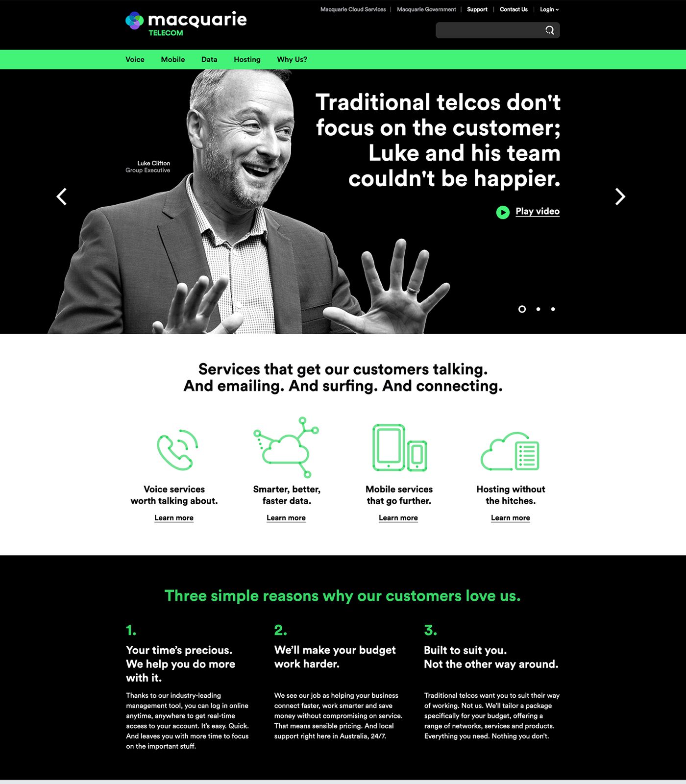
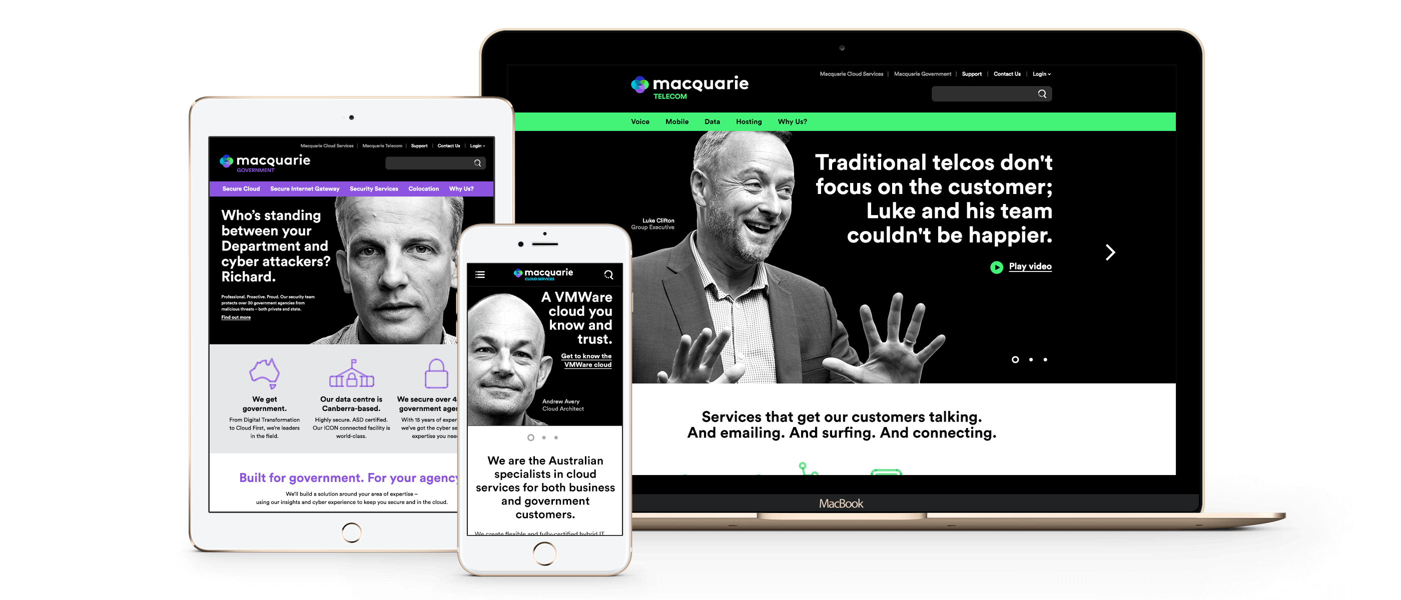
The ‘enthusiastically human’ brand idea involved a unique set of assets for the 3 individual business units (Telecom, Cloud and Government).
Rysen was challenged to create 3 unique experiences tailored to each business unit target market while maintaining the essence and brand ethos which Macquarie had worked very hard to implement.
Solution
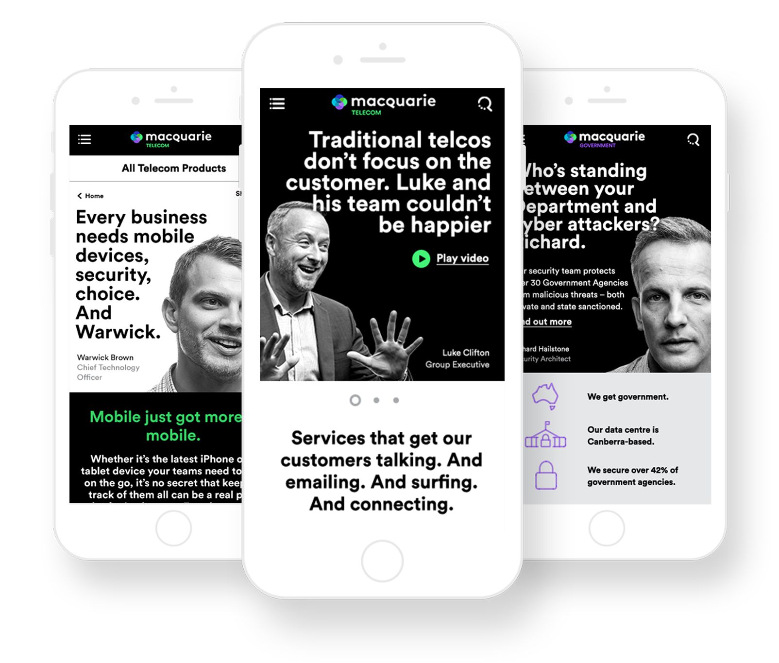
The idea was to deliver 4 different websites (one for each business unit and one for the overarching Macquarie Telecom Group) that offered a narrative like experience tailored to each target market while utilising the unique branding elements assigned to each business unit. Through numerous user experience workshops and
customer journey mapping sessions, each websites architecture began to take shape. Although different in offerings and branding assets, each business unit followed a similar philosophy and execution. By keeping the navigation structure the same across all business units and applying the unique branding elements the user was easily able to identify which website they were viewing.
Results
The objective to deliver 4 unique websites which smoothly ushered users through the content while ensuring ‘enthusiastically human’ branding elements were implemented was met with resounding success.
Macquarie Telecoms NPS score of +66 is testament to their commitment to this objective. The new websites and digital brand transition has received extremely positive feedback, not just internally but with also with their customers.
The ease in which users can find the content they’re looking for and the uniqueness and differentiation in creative delivery has helped increase not only brand awareness but also customer enquiries.
"This is not simply a fresh coat of paint – far from it. The new look continues the evolution of the business over the past two years, builds on our strengths, communicates our difference, and separates us from competitors"

